Lavender & Powder Blue
Intro
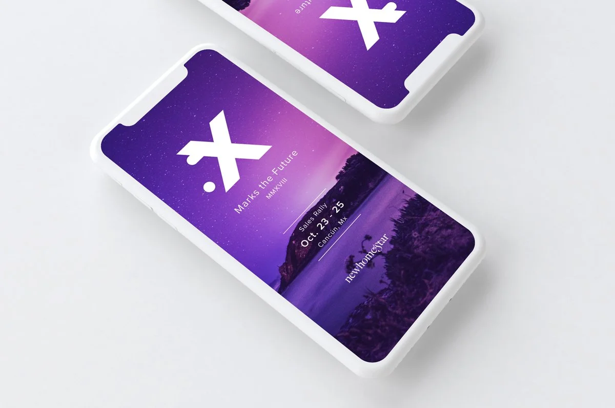
Digital Marketing Campaign
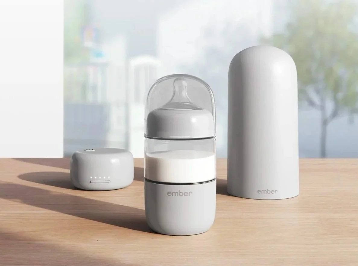
Ember Technologies develops temperature control smart mugs that can be set to a specific temperature via the Ember app. This allows customers to enjoy their coffee, tea, or any other hot beverage at their preferred temperature for up to 3 hours on a full charge. Overall, Ember Mugs offer assurance that your favorite beverage will stay delicious and warm, no matter how busy you get.
3 Weeks
Ember Technologies
Project Scope
Two new colors, Lavender and Powder Blue, were set to launch in Fall 2024, and Ember needed an exciting digital campaign for their audience. At the time of campaign development, the marketing team consisted of 5 members, where I was the sole Graphic Designer. I was tasked with establishing the art direction for this digital campaign, consisting of social and email marketing.

Research
Since we needed to create our own imagery for this campaign, I began researching various styles of photography that were centered around the two core colors, lavender and powder blue. My goal here was to gather inspiration for product photography that inspired movement and playfulness. I found myself drawn towards monochromatic color palettes and texture.

Ideation
In the early stages of this project, we discussed various keywords and phrases to use for this campaign, and as a team, we were drawn towards “dreamy”. With that in mind, I collaborated with the brand team to establish key photography and messaging.

Design
The initial photography had each mug resting on a pale purple backdrop. There were a couple of variations featuring glitter, a rainbow light projection, and a milk pour to offer variety.
After editing the photos, I began working through various compositions for our digital ads, email marketing campaigns, and website assets. Since these were the most colorful mugs to date, I aimed to make these ads pop through the use of playful typography and composited imagery.
Solution


We aimed to captivate our audience and transport them into a relaxing dream world where these two new colors lived. Through playful copy, we reinforced the idea of magic and youth within this campaign.

Social
Since these colors were a departure from the previous natural-themed color launches, I chose to highlight the new colors with their own distinct typography and color palettes.
Key Takeaways
-
You must be on the same page as your teammates to establish a compelling campaign. Laying down a strong foundation with your peers allows everyone to stay on target.
-
This campaign was all completed in-house using our team’s skillset. With everyone willing to pitch in, we crafted a beautiful campaign that highlighted each of our strengths.
-
After these colors launched, they sold out multiple times. Customers loved the lavender option, and many asked for additional colors such as pink or a muted yellow. I believe color is a great way to spruce up a space, and it’s clear that consumers feel the same way!