X Marks the Future
Intro
Event Marketing
This sales rally event was centered on celebrating the 10-year anniversary of a Chicago-based company called New Home Star. Not only was this event about reflection and training, but it encouraged sales agents to look forward to what the next decade would bring.
Art Direction
New Home Star
Project Scope
As the Lead Graphic Designer, I was tasked with establishing the creative direction for this event. While working with my team of designers, we established a strong visual language for this event, which transported attendees into the future of New Home Star.
Research + Development
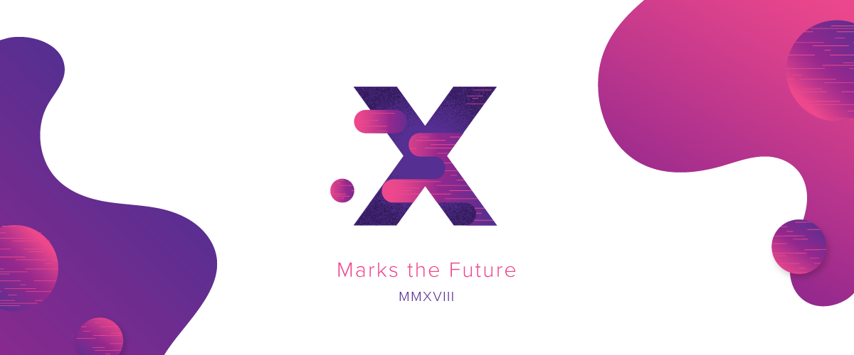
Ideating with a team of creatives is one of my favorite ways to kick off a new project. For this event design, we were tasked with developing a logo around “X” or “10 years” to celebrate the company's decade of operation.
I asked the designers on my team to work on a handful of logo concepts, which we presented to each other and talked through any lingering ideas. From here, we collectively decided to use the concept I brought to the meeting - a stately “X” with amorphous blobs that showcased movement and represented ambiguity.
Moving forward, I established the visual language for this event.
Style Guide
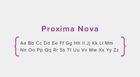
Typography
Proxima Nova is a clean sans-serif font that worked perfectly with our futuristic motif. The logo mark’s complex design allowed for this simple logo type to shine.
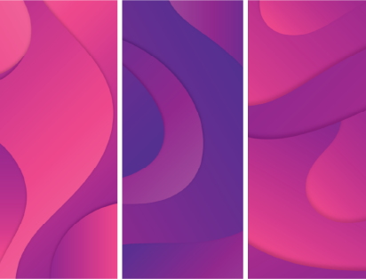
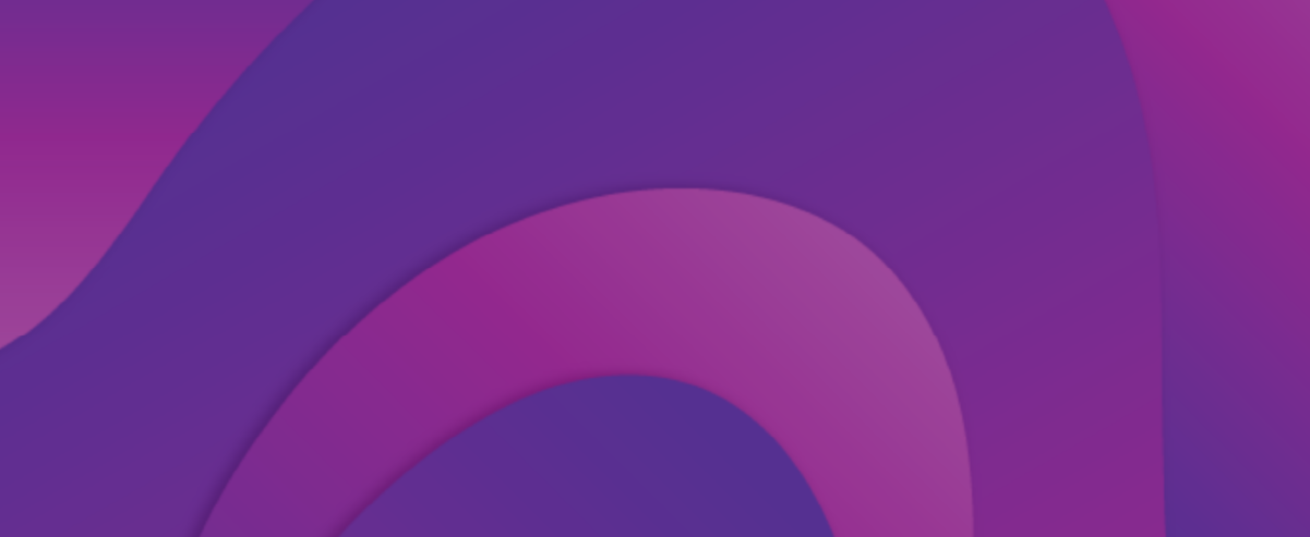
Patterns
Wanting to continue this lava-lamp motif, I created a handful of gradient patterns that were used throughout all design materials to create dynamic shapes and cohesive visuals.
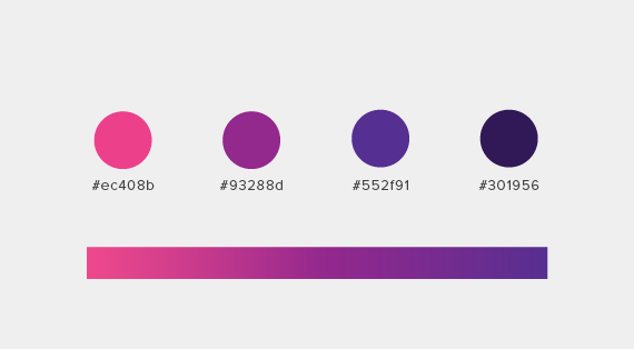
Color Palette
Pops of bright pink, magenta, and a deep purple were used to create a vibrant and eye-catching aesthetic for this event. I was inspired by cyber-punk neon lights that cast warm glows and artificial hues.
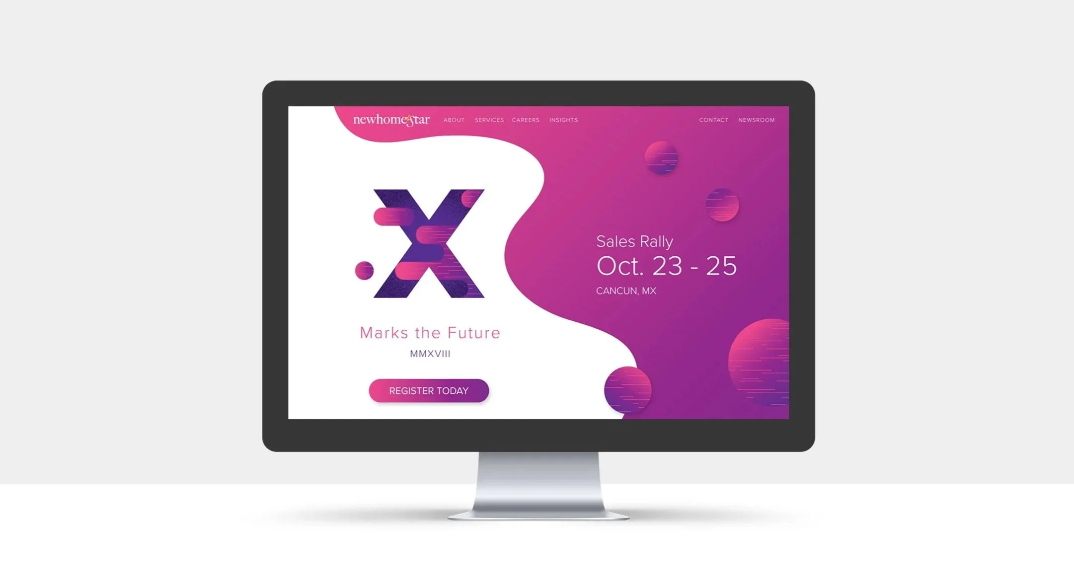
Landing Page
This dynamic landing page was used for registration and key information for this company-wide event. It featured a countdown clock, year recap video, and FAQ’s for attendees to sift through.
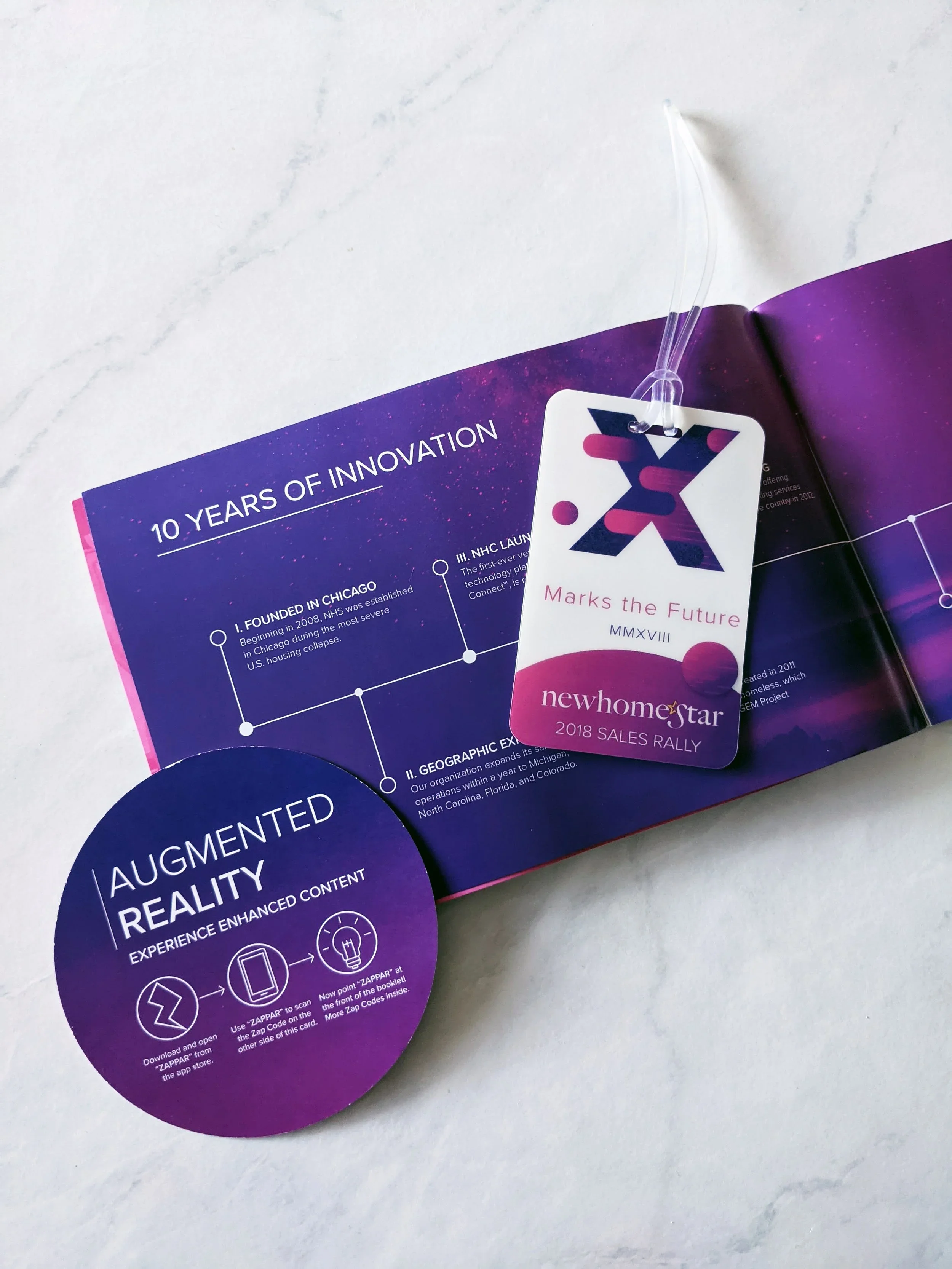
Augmented Reality
Wanting to take direct mailers a step further, I brought the idea of using Augmented Reality (AR) to the Marketing Manager. We ended up incorporating it into the Welcome booklet, where agents could scan a code, then use their phones to unlock video content by scanning the pages.
I worked closely with the videographer to develop and animate a 3D version of the event logo which popped off the cover, spun around and landed back on the page. The other videos were of the guest speakers who were able to detail their segments and show off their sparkling personalities before the event began.
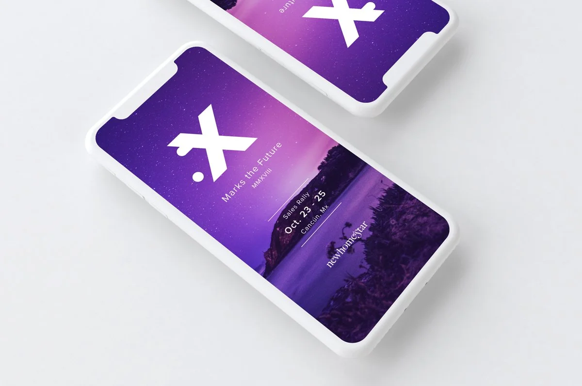
App Design
We used a third party vendor for the app mechanics and structure, however we were allowed to provide designs for the splash page, banners and icons.
The app allowed event attendees to review schedules, sign up for events, and participate in company-wide games like scavenger hunts!
Key Takeaways
-
AR was not a specialty of mine, however, my team encouraged me to explore what this could mean for marketing this event. This led me to collaboration with the video team and allowed me to explore a new way to bring event branding to life.
-
As a team lead, I enjoyed collaborating with the other designers on this project. I never wanted them to feel less than, so I included them in the design process from start to finish. This allowed the team to be on the same page and produce pieces using the established visual language.
-
Use bold colors, interesting visuals, and take a departure from the norm once in a while. If a design or aesthetic is pulling you in, ride it out as far as you can. Once you take a step back, you’ll be able to see how much you’ve grown along the way.